

DES!GN 2011
European Graphic Design Festival
European Graphic Design Festival
Final Major Project was the last project of my BTEC National Diploma in Graphic Design course, and took place over 8 weeks.
For the project we had to write our own brief; deciding on a theme, final outcomes and an essay topic.
I chose to undertake designing and organising a Graphic Design festival, complete with exhibitions, speakers, workshops and an awards ceremony.
I decided my final outcomes would be 5 posters 1 poster per week and then 1 poster for the overall festival, 2 programmes, 4 tickets and development for a website and awards ceremony.
After looking at 45 Design Festivals worldwide, I decided on a name; DES!GN. I then designed a logo, which turned into a logo which changed every week to create weekly identities.
The four weeks were decided to be:
Typographical Design Week
Design For Publishing Week
Design For Branding Design Week
Packaging Design Week
The thinking behind the scribble patterns is that designers usually start with hand drawn sketches and ideas and then move on to more polished designs on screen. A lot of creative people doodle while thinking and sketching ideas, so I wanted to play on this. Another reason is that I wanted my festival to stand out from the rest, which all use very clean typography, and so used a mix of stylish Helvetica with a pinch of creativeness.

Here are the 5 posters; the main festival poster at the top with weeks 1 - 4 below.

Shown here are the envelope, ticket holders and a ticket.
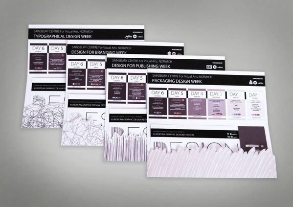
Here are the 4 ticket holders - 1 for each week. These would be recieved in the post, and act as a form of storage for the tickets as well as a festival guide due to the weekly timetable being included.
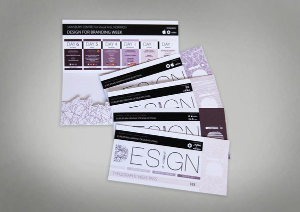
Here are the 4 ticket designs. The ticket was based around the poster layout to keep the whole branding of the festival consistant. They feature a tear off stub which can be kept as a momento.
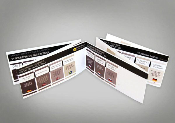
This is the programme. I adapted the layout of the poster to produce an easy to read format to display day to day timetable information. Each programme is one single piece - A0 width. It was really nice as a piece, a shame I had to cut it in some ways...

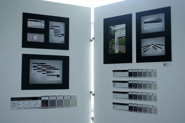
Above are my display boards at the end of year exhibition.


